This support guide explains the functionality and how to use the Website Forms section of the Leads Management module.
Step by Step Guide
To access this section, click on the Leads header in the left hand navigational menu. This will then expand the module and display all the sections available to you. Click on "Website Forms" and this will expand to display the options available to you.
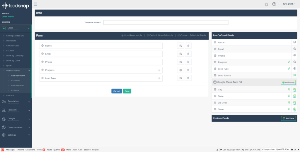
Click on "Add New Form" and you will be presented with the screen below.
Template Name
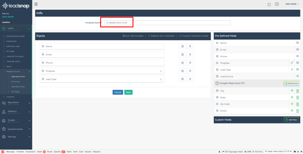
The first thing you will need to do is to name the template so it can be assigned to Companies to use on their sites.
This is done in the "Info" area at the top of the screen. The Template Name field is the only field situated in the middle of the screen. Enter the name you wish to identify this form. The name would usually reference the company you are going to associate it with, to make it easier to search for and find in the dropdown list.
Form
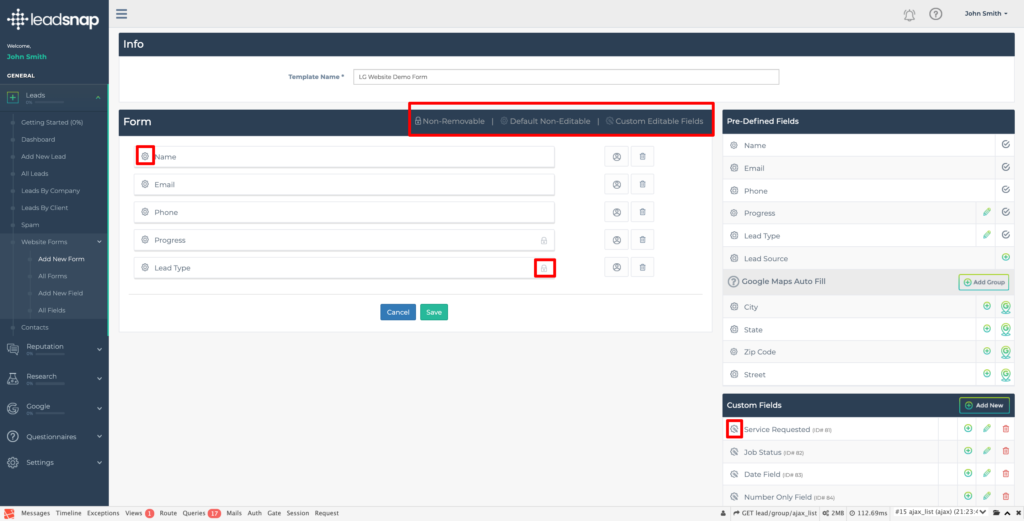
This area displays all the fields that this form will capture for the company it is assigned to. There are three types of fields and they each have an icon so you can easily recognise them.
- Non-Removable - These are always on the form by default and cannot be removed
- Default Non-Editable - These are standard Pre-Defined fields who's usage and names cannot be altered
- Custom Editable Fields - These are fields created by you and can be edited and renamed according to yours or the companies changing requirements
The legend is also on the title bar of the area for reference.
Edit Field Settings
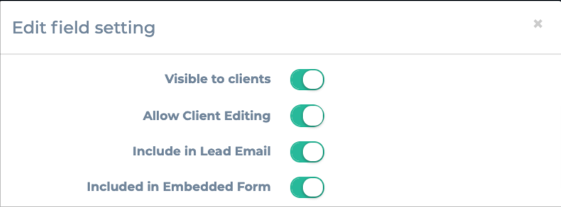
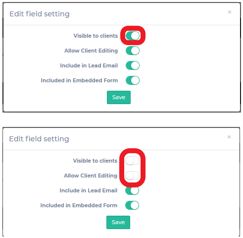
Each field has four settings that are configurable, regardless of their type. These are used to determine if the fields are visible to the clients, editable by the clients, included in the lead email that is forwarded and if it is included in the embedded form that appears on the site.
All except one work independently of each other and can be toggled on/off by clicking on the circular button. When the button has a green area showing to the left of the button, the setting is Enabled. When the button has a white area showing to the right of the button, the setting is Disabled.
The "Visible to Clients" setting is the only one that can affect another automatically. If you disable this, and the "Allow Client Editing" is enabled, the it will automatically disable the "Allow Client Editing" as well. This is because it is a logical step to do so. However, it will not enable the client editing when doing the reverse as this is not necessarily a logical step.
Adding Pre-Defined Fields
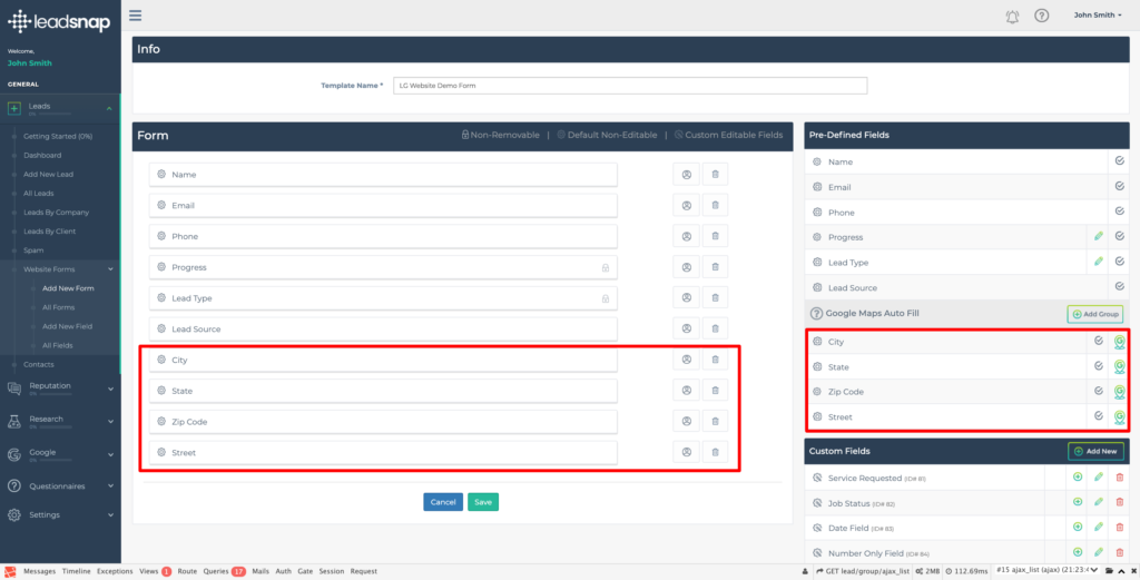
Pre-defined fields, or system generated fields, are standard for all forms, for example Name or Phone. To ensure the stability and consistency of the system they are also non-editable. They cover your basic information as well as data from Google Maps, which are automatically filled.
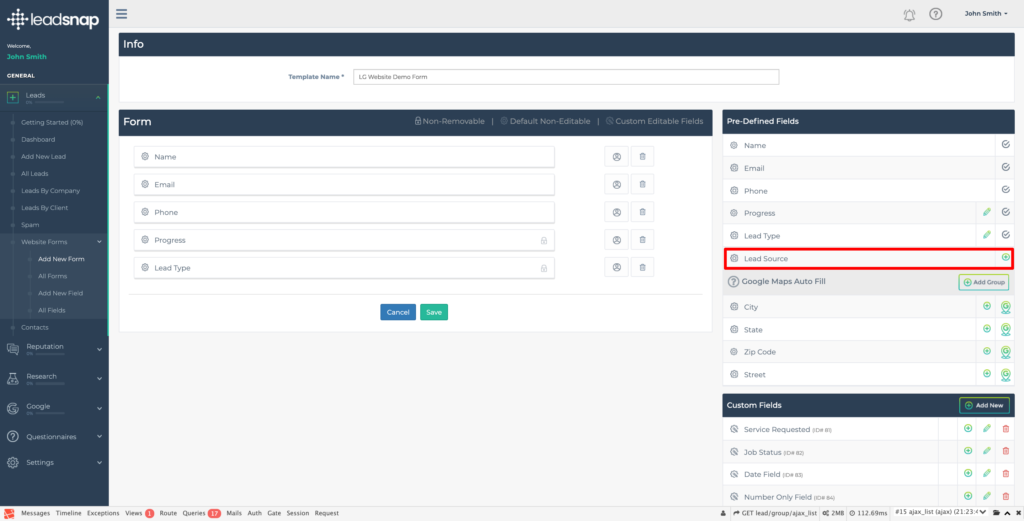
You will see a list of the Pre-defined fields on the right hand side of the screen.
To add a pre-defined field you need to click the green circled + sign. This will add it to the bottom of the current list of fields in the Form area. The + will be altered to a grey circled
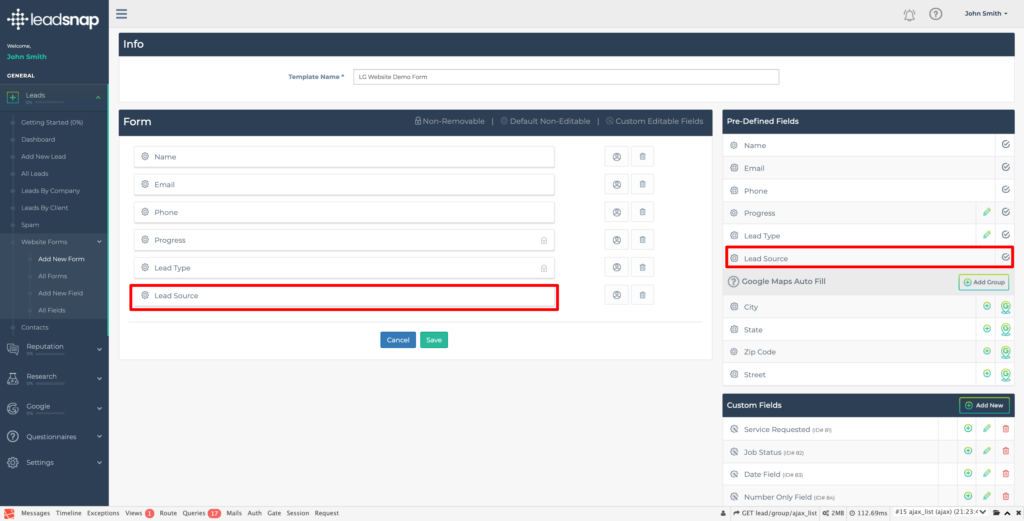
When a pre-defined field is added, you will see it listed under the Form area and in the Pre-Defined Fields listing you will see a circled tick. This indicates it is now listed on the Form.
Adding Google Maps Group
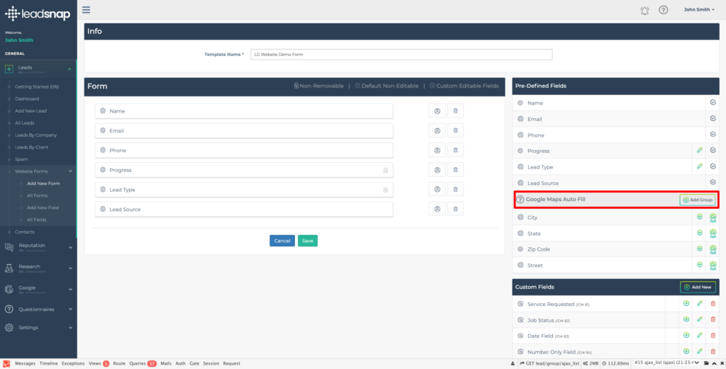
The group of Google Maps Auto Fill fields have the ability to be added all by the click of a single button. On the group title bar there is an "Add Group" button on the far right.
Adding Custom Fields
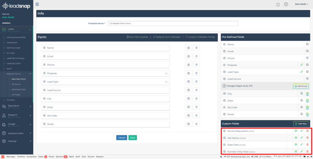
Custom Fields allows you the opportunity to create and add niche specific fields to capture data in. The list of these can be found underneath the Pre-Defined Fields on the right hand side of the screen.
When you create your first form, your list of Custom Fields will be blank. Once you've added new custom fields, they will be available for you to use across all future forms.
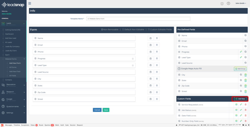
To create a new custom field, you will first need to click on the "Add New" button. This is located at the far right of the Custom Fields header bar.
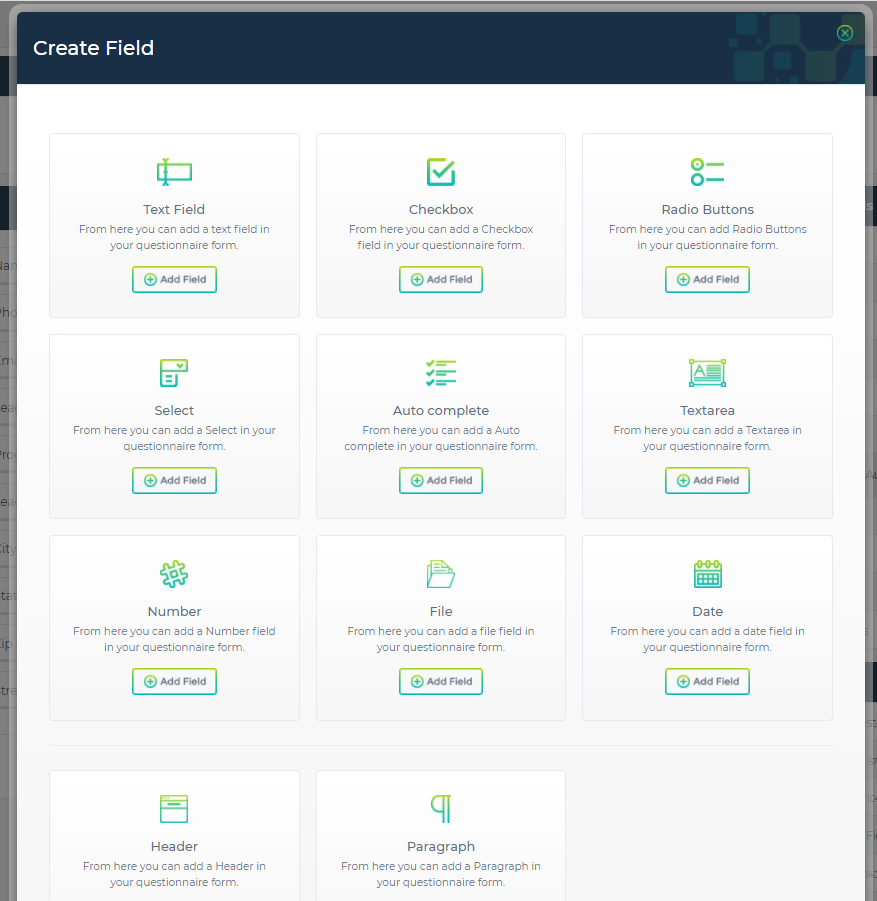
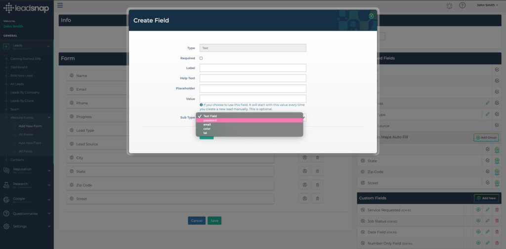
The Create Field pop-up window will display the options you have to choose from.
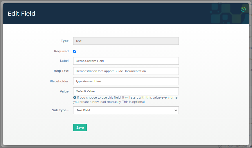
Choosing a new Text Field as an example, you are then presented with the configurable attributes related to that field type. For a text field you have the following:
- Required - Checkbox to enable/disable if this field should be mandatory
- Label - The title or name given to the field e.g. "Phone"
- Help Text - Information to the customer to help them add the correct information that sits underneath the field
- Placeholder - This is the instruction text that will sit in the field but disappear as soon as the customer begins typing
- Value - Optional default value
- Sub Type - What type of Text field is it. Standard Text, Email, Password etc
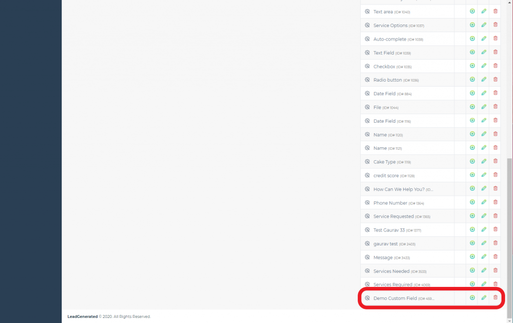
Once you have set all of the attributes, click on Save and the new Custom Field will be added to your list on the right hand side of the screen. If you already have some then the new one will be added to the bottom of the existing list.
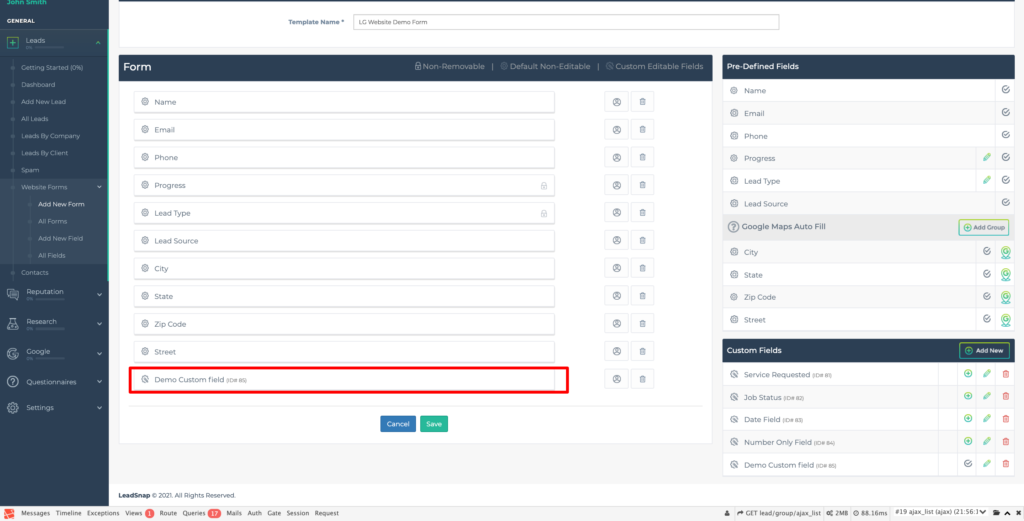
To add the new custom field you simply click on the green circled + as per the Pre-Defined Fields. It will be added to the bottom of the Form list and then have a grey circled tick next to it in the list.
With the form now completed as required, click the Save button. This will save the form and redirect you to the All Forms list under Website Forms menu module.

