Current active form (Left Side)
When you open the form builder you will see there are a few different parts and pieces. The left side of the screen will show the list of fields that have been added to the form you are working on. Depending on the module that you are using the form builder with there are different options. The image below shows you the form builder for the lead intake forms.
Available Fields (Right Side)
Along the right side are the fields that you can add to the currently active form. The available fields fall into a few different categories. There are pre-defined field types and custom field types.
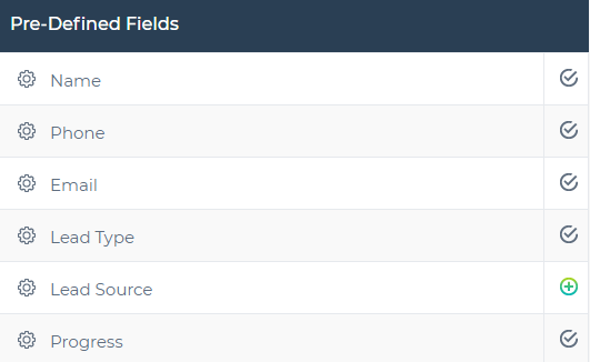
Pre-defined Fields
We have created a number of fields for you for the most common things. Within the pre-defined fields, there are two subgroups the common fields and the Google Maps auto fill fields. There are some major advantages to using these fields so we encourage you to use these whenever possible. The predefined fields are only available for the lead intake and client onboarding modules.
Common Fields
Most of your forms will include some if not all the fields in the top section of the pre-defined fields section. Whenever possible take advantage of these fields as opposed to creating similar versions within the custom fields section.
Google Maps Auto Fill
Within the pre-defined fields you will notice there is a subgroup called "Google Maps Auto Fill". This group of fields can work as a team when added together. They take advantage of auto-complete pulling information from Google Maps. Using this group of fields for address information will save you time and avoid mistakes.
This shows the Google auto fill fields in action.
Custom Fields
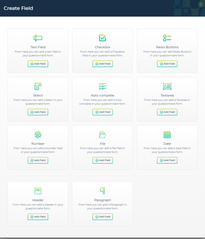
If the pre-defined field types do not meet your needs you can create your own custom fields and use them as many times as you can throughout the application. There are 9 different choices you pick from for custom fields. The names of custom fields do not have to be unique but each custom field has a unique ID. You can use this to always identify which field you are working with.
To add a new custom field click the add new button on the right side.
Available Custom Field Types
- Text field - a field that allows text to be entered.
- Checkbox - check a box for one or multiple options.
- Radio buttons - select only one option among several choices.
- Select box - a drop-down box where you can select one option from several choices.
- Autocomplete - type and choose an answer from predefined options.
- Textarea - larger text area often used for comments.
- Number - a text field that accepts numbers only.
- File - upload files. (limited to png, jpg and pdf files)
- Date - a date selection field.
- Header - not a form field header title field used to label sections of a form.
- Paragraph - not a form field, block of text can be used for instructions.
Once you have selected the custom field type that is most appropriate for the type of data you are capturing, click the add field button. You will now be presented with a second popup window that will allow you to customize the field further. The options on the second popup window are different for each field type.
Adding and Deleting Fields
Adding Fields
To add a field to the existing form click the plus sign next to the field you would like to add. You can only add each field to the form one time. After adding a field to the form it will change from the plus sign to the checkmark sign to indicate it has been added. Certain fields are required (depending on the module) for our system to function properly. In these cases, they will not be able to be removed from the active form.
Click this plus sign to add a field to the active form
Deleting Fields
To delete a field from the existing form click the trash can icon next to the field you would like to delete on the active form. You can only add each field to the form one time. After deleting a field to the form it will change from the checkmark back to the plus sign on the right side (available fields).
Click this delete icon to remove a field to the active form


