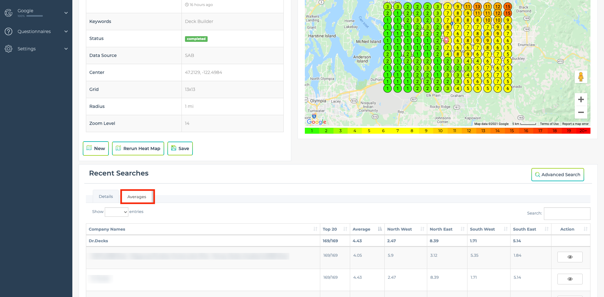
The graph is really pretty with all the colors and the map, but wouldn't it be great if we could see the hard numbers from the graph? That's exactly what the averages tab provides for you. You can access by clicking on the tab in screenshot below.
Support Navigation
-
- Automation Example Review Request
- Automation Example Pipeline Stage = Quote Follow-up
- Automation Example Pipeline Stage = Provided Quote
- Automation Example Phone Lead Nurturing
- Automation Example Missed Call To Text (Client & Lead)
- Automation Example Form Lead To Pipeline
- Automation Example Form Lead Notification
-
- How To Setup Citations
- How To Automate Replying To Future Reviews
- How To Reply To Existing GBP Reviews
- How To Create And Schedule GBP Posts In LeadSnap Using AI
- How to Setup a Heatmap Schedule
- How to Setup Rank Tracking for Your GMBs
- How to Setup Call Tracking
- How to Create an Automation
- How to Setup and Use GBP Management
- How to Connect Your WP Website to Pull In Form Submissions
- How to Run a Heatmap
- How to Create and Schedule Reports
- How to Add a New Client and Create a Custom Role
-
- Lead Management Overview
- Lead Flow
- Add a new company
- Create Client User
- Connect WordPress
- Embed Form
- Connect Weebly
- Website Forms Overview
- Mapping Form Fields
- Auto Lead Forwarding
- Qualified Call Filters
- Deactivate Company
- Add New Website Form
- Assigning Company (Website Form)
- Add Email Account
- Lead Management Email Settings
- Automations
- Why Are My Calls Not in All Leads?
- Advanced Search and Filters
How does the average work?
You will notice that each grid point has a number, that is ranking for the specific company within the GMB area of the search results for the given search term if it had been performed at the location it aligns with on the map. As you can see in the image below we have created a 3 by 3 grid which means there are 9 different grid points on the map. If we total the score from each of these grid points we will get 28 points. To calculate the average we divide the total points of 28 by the number of spots there are on the grid. 28/9 = 3.11.
What is Top 20?
Our heat map only tracks the top 20 positions for each point for any given search term. The top 20 field shows you how many times this company appeared within the top 20 for the given heat map. So if you run a 9 x 9 grid there are 81 available grid points. If they appear in the top 20 for every grid point then you will see a result that says 81/81.
Northwest, Northeast, Southwest, Southeast
For these columns, we are giving you the average score but only for 25% of the grid at a time.
Northwest - Top left 25% quadrant of the map
Northeast - Top right 25% quadrant of the map
Southwest - Botom left 25% quadrant of the map
Southeast - Bottom right 25% quadrant of the map


